What Does the mys Brand Mean?
01st Feb 2024
Blog
Rebranding with Purpose: Our New Visual Identity
You may have noticed something different about us recently – a fresh, vibrant look that speaks volumes about who we are and what we stand for. As a fresh name in the shared living industry, mys isn’t just changing its look. We’re making sure that what we believe in and aim to do shows in every part of how we look and feel.
Why the name ‘mys’ pronounced: [MEES]
mys is a Swedish word that means something like “the particular kind of cosiness that comes from spending quality time with friends and family”. That’s the kind of feeling we want people to have in a mys building. We’re ok if you can’t pronounce the word (turns out it’s quite hard and everyone says it differently anyway) but we’re here for what it means and everything that goes with it.

What we do
At mys, everything we do is connected to why we rebranded. We believe shared living can really make life better. That’s why we create places where people who share our values can do well together. Our new look shows this commitment – we’re not just about great living spaces; we’re a values-led company caring for each other, the businesses we work with and our planet.
A Values-Led Living Brand
At mys, we’re about providing accommodation and creating a community that reflects our values. Our rebranding relatively early into our business journey is a testament to our commitment to ‘do, better’ one decision at a time. This ethos is woven into the fabric of our visual identity, symbolised by our new logo, which emanates from the ‘Y’ – representing ‘why’ we do what we do. Our why is doing better, by actively making decisions that are good for the people and the planet, and good for the business. One tiny decision at a time.
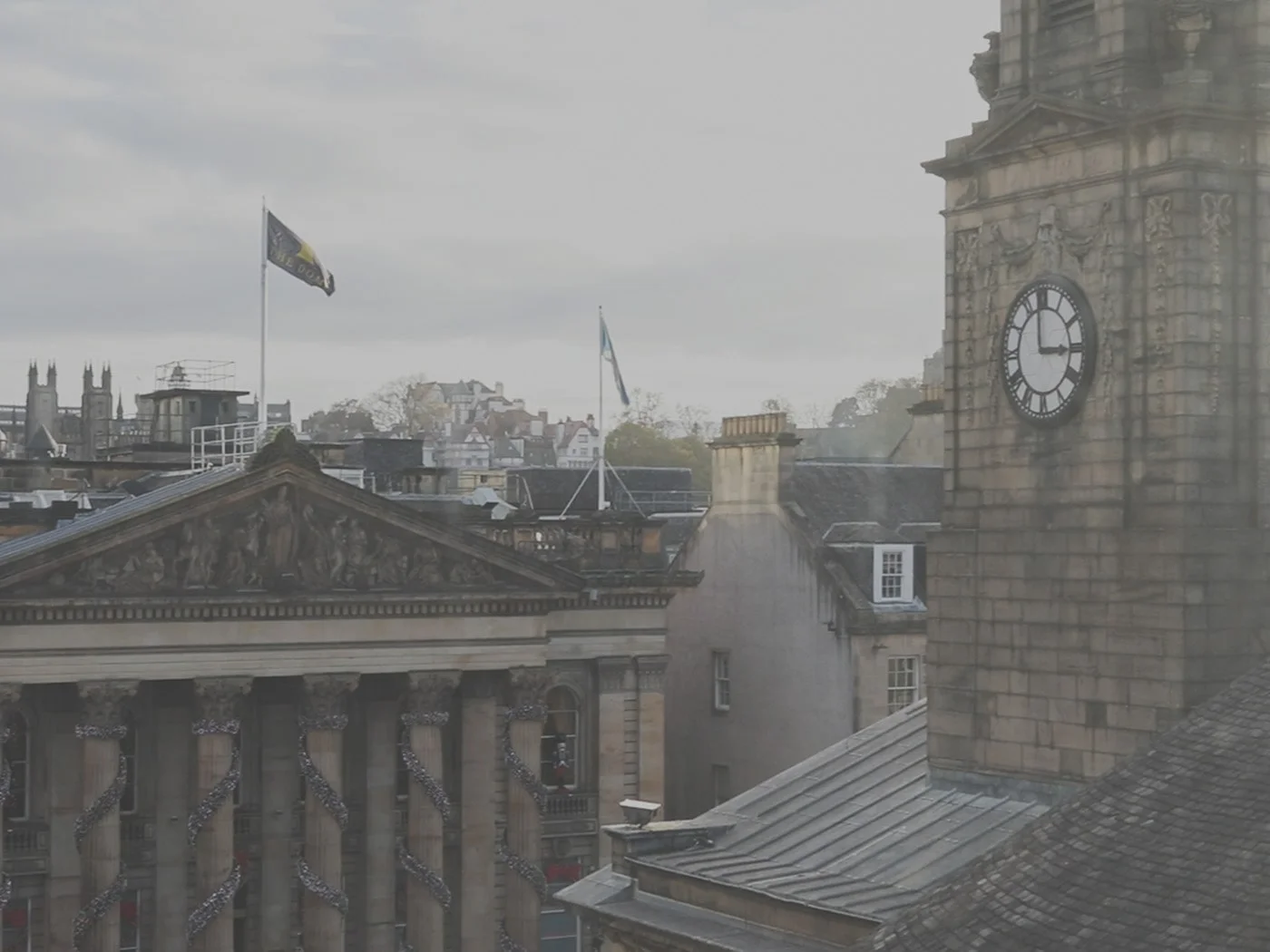
Inspired by Edinburgh
Our new colour palette is rooted in the landscape and heritage of Edinburgh, our proud home. The neutral shades draw inspiration from the historic Flodden Walls, symbolising strength and resilience. The lime mirrors the local bog myrtle plant, reflecting growth and vitality. The cherry hue echoes the blossoming cherry trees on Princes Street, offering a glimpse of beauty and inspiration. Additionally, the colours are deliberately muted to reduce the carbon footprint of running our website and producing branded collateral, further aligning our aesthetic choices with our commitment to sustainability.
Looking Ahead
Our new identity is more than just a visual makeover, it’s a reflection of our ambition to continuously evolve and improve. We’re redefining student living and we’re redefining excellence.
Join us on this journey as we strive to do better, for our students, our investors, and our community.
09th Mar 2026 Blog
Celebrating B Corp Month: Collaboration That Drives Real Impact
16th Jul 2025 Blog
Facing the Future: Key Takeaways from the 2025/26 PBSA Digital Roundtable
13th Jun 2025 Blog